Thursday, 28 March 2013

Quick Tips: How to use a viewfinder for observational drawing and painting

The Basics
Always hold the viewfinder the same distance from yourself and your subject (at arm's length, keeping your elbow locked), so that you get a consistent view through the viewfinder.  Before you begin to draw make a note of two or three key points where objects appear to meet the edge of your viewfinder, this will allow you to accurately line up your viewfinder later while making your drawing. Keep the viewfinder straight both vertically and horizontally, the tendency to tilt towards the scene should be avoided as this will create distortions.

1) Use your viewfinder to focus in on an area of the subject. 
Looking at a whole landscape or still life can be daunting so use your viewfinder to select one view to concentrate on. Think about what would make the most interesting composition.

2) The picture plane
The easiest way to understand the term ‘picture plane’ is to place a piece of acetate on a window, and to draw what you can see, as if tracing from life. The acetate on the window is your picture plane.

Drawing from life rather than copying a photograph is something that beginners often struggle with as it involves converting a 3-D object into a 2-D drawing on their paper. Drawing with a viewfinder helps by framing the subject and giving the impression of a flattened picture plane.

3) How to use negative shapes to improve your observational drawings
Negative space is the space around and between subjects in an image. Too often when we draw something, we stop observing and start drawing from memory. Instead of drawing what is in front of us, we draw what we know and remember about the subject. So, for example, when drawing a mug, we start thinking "I know what a mug looks like" and don't observe the precise angles of that particular mug. By changing your focus away from the mug and to the negative spaces – such as the space between the handle and the mug, and the space underneath the handle and the surface the mug is sitting on – you have to concentrate on what's in front of you and can't work on 'autopilot'.  Often by working from the negative spaces rather than focusing on the object, you end up with a much more accurate drawing.

Frame an object (such as a chair) with your viewfinder making sure the object appears to touch at least 2 sides of the viewfinder rectangle. This forms a border around the object and enables you to see the negative space between the chair and the borders as ‘trapped’ shapes. It might take you a while to get used to seeing the negative spaces as shapes, so be patient.  Draw a border on your paper the same rectangle ratio as your viewfinder.  By noting where the object appears to touch the border of your viewfinder, you should be able to recreate the negative shapes on your paper. Observe both the positive and negative shapes; start with the biggest shapes first, leaving detail until the end.  

Happy drawing!

Friday, 25 January 2013

Quick Tips: How to make a viewfinder

Whether you are sketching in the countryside or are looking at a still life in class it is often hard to know what to draw and what to leave out!  This can often lead to disappointing compositions.  A viewfinder is a simple tool used for first finding an interesting composition and then judging the positions of objects while drawing.  First you need to make your viewfinder; there are many different ways to do this; make sure you choose one that will suit your purpose. 

Example 1

1) Use a sturdy piece of card that won't bend when it is picked up.
2) Draw two diagonal lines from corner to corner that cross in the middle

 
3) Measure across the diagonal lines to draw the rectangular window, make sure your lines are straight, use a right angle ruler or set square if necessary. 


4) If you are drawing on ‘A’ series paper, draw the rectangular window to measure; 105 x 74mm, 74 x 52mm, 52 x 37mm or 37 x 26mm.  The rectangle in the middle should now have the same proportions as your drawing paper so that the edges of the viewfinder’s window represent the edges of your paper.

5) Carefully cut out the viewfinder window with a scalpel and metal ruler.


Example 2
  1. Use a pencil and ruler to draw two corner shapes on thick card; they should be the same size. The corners should be around 50mm wide so they stay rigid when held up.
  2. The length of the corners depends on the size of your card and how large you will need your viewfinder to be. Around 200mm should be sufficient.
  3. Cut out the corners.
  4. Place the one corner over the other so they overlap, forming a frame.
  5. By moving the two corners, you can change the size and proportions of the window, adapting it to relate to any paper or canvas proportions.
  6. Use two paper clips to keep your corners in place.

 
Example 3
An old slide frame can make a very useful small viewfinder.  With the added advantage of being able to draw different compositional devices on blank slides and swap them over.


 Empty slide and slide with the rule of thirds.

Example 4
You could also use a sheet of acetate combined with a card border to divide your window into thirds, the golden rectangle etc.

Golden rectangle and Fibonacci spiral on acetate

Example 5
There are also many different types of viewfinders that you can buy but why spend out on something that is so easy to make?

In part two we will look at how to use your viewfinder...

Wednesday, 16 January 2013

Pre-Raphaelites at Tate Britain and Millais' Christ In The House Of His Parents

“Led by Dante Gabriel Rossetti, William Holman Hunt and John Everett Millais, the Pre-Raphaelite Brotherhood (PRB) rebelled against the art establishment of the mid-nineteenth century, taking inspiration from early Renaissance painting. The exhibition establishes the PRB as an early example of the avant-garde: painters who self-consciously overturned orthodoxy and established a new benchmark for modern painting and design. It will include many famous Pre-Raphaelite works, and will also re-introduce some rarely seen masterpieces.” - Tate Website


Last week, I finally got to Tate Britain to see the exhibition Pre-Raphaelites: Victorian Avant-Garde.  The PRB are a favourite of mine and it was great to see so many of their paintings all together (along with predecessors’ and followers’ works).  Many of the paintings had been borrowed from other collections, some of which, I was finally seeing in the flesh for the first time.  It was also great to see paintings that I see every time I visit the Tate, given their own breathing space (rather than crammed in and too high up to see properly).  Viewing these works in this context surrounded by other PRB paintings was very interesting; Hunt’s The Finding Of The Saviour In The Temple had been placed side by side with Millais’ Christ In The House Of His Parents, as well as being of a similar size and looking very impressive next to each other the curator is cleverly inviting us to compare these two approaches to depicting the childhood of Jesus.  Millais' Christ In The House Of His Parents is one of my favourite paintings and in this post I have attempted to examine this work and its appeal.
 
John Everett Millais, Christ in the House of His Parents (The Carpenter's Shop), 1849-50, Oil on Canvas, 86.4x139.7cm

When first exhibited, this controversial painting was not well received because of its use of realistic figures and environment, (the interior was painted from a real carpenter's workshop).  One critic described it as ‘pictorial blasphemy’ and the well known author Charles Dickens was particularly vehement in his criticism of the depiction of Mary calling her "horrible in her ugliness".  Viewing the painting today, from a 21st century perspective, I don’t see ugliness, I see ordinary people with dirty fingernails, wrinkles, even a receding a hair line, in Joseph’s case.  The idea of the holy family as real working class people rather than idealised figures incensed the critics of the day but this is exactly what draws me to this work.   

The painting combines real models and emotions with layers of symbolism and slightly stylised poses; reminiscent of early renaissance masterpieces, along with keenly observed detail that brings to mind the work of Dutch baroque masters, with their intricately detailed subjects caught in a luminous stillness.  All this creates a mystical, otherworldly feel that is prevalent in the work of the PRB.  Although some critics dislike the combination of these elements, feeling that the works are oddly dislocated. I feel that this painting has a romanticised, reverential and thought provoking atmosphere.    

The painting shows an imagined scenario not described in scripture.  It was unusual but not unheard of to depict an event not specifically mentioned in the Bible and meant that Millais had the advantage of being released from many of the set rules associated with familiar biblical depictions.   Furthermore in the Bible there is very little information on Jesus' childhood and so the artist is free to imagine what the child Christ's life could have been like.  The exhibition includes an earlier version of this subject by John Rogers Herbert. Although we can see hints of Pre-Raphaelite leanings Herbert’s painting has a soft approach to the modelling of forms, his use of colour is more harmonious and muted while the use of typical old master garments and softened idealised faces contrasts with Millais radical realism.  

John Rogers Herbert, Our Saviour, Subject to His Parents at Nazareth (The Youth of Our Lord), 1847-56, Oil on Canvas, 81.3x129.5cm

The family dynamics also take on more emphasis in the Millais as the characters interact and create a narrative that is easily read. The painting also contains much symbolism to aid the narrative.  

Jesus has cut his hand on a nail in Joseph’s workshop his mother has come to comfort him but appears more distressed than Jesus, who offers her a comforting kiss. Mary's forehead is wrinkled as she lifts her brows in an expression that conveys more than just love and worry, to a fervent devotion. Perhaps her distress is a sign of her recognition of her son’s future death, which is prefigured by the cut on Christ’s palm and drop of blood on his foot.  The carpentry tools in the background are further symbols of the crucifixion while the ladder suggests the building of a cross rather than the door currently being constructed.  Joseph examines the cut, moving Jesus’ hand into a gesture of benediction as he does so, while young John the Baptist brings water to clean the wound.  John carrying the bowl of water and the dove in the background brings to mind the later event of Jesus’ baptism especially the work of Piero Della Francesca, an early renaissance artist.

Piero della Francesca, The Baptism of Christ, c.1450, Egg Tempera on Poplar, 167 x 116 cm

The Holy Trinity is symbolised by the carpenter's triangle on the wall, above Christ's head.  St Ann is seen removing the offending nail from the door.  The last figure, described as an assistant carpenter, balances the composition and many regard this as the reason for his inclusion, I find him an interesting addition and a reminder that the Holy family lived and worked in a community and did not exist in an isolated ‘alternate reality’, which many old master works would seem to suggest.  Across the gallery is hung Hunt’s Light of the world in which Jesus stands at a door and knocks, the door here symbolises the door to the soul described in Revelation 3:20 and I wonder whether it was coincidence that Millais’ depicted the holy family at work around a door or was it a deliberate symbolic inclusion? 

William Holman Hunt, The light of the World, 1851-2, Oil and Gold Leaf on Canvas, 122x60.5cm 

Years after I first viewed Millais' Christ In The House Of His Parents I still find it captivating and continue to see more and more within it, I hope that my musings inspire you to delve under the surface of other familiar works. 

Overall this was a fascinating and inspiring exhibition, which was well worth the visit. You can find out more about the PRB by following the links below.

Thursday, 6 December 2012

Quick Tips: Shadows are not solid objects

Having been teaching for a few years now, it seemed like a good idea to share some tips, based on subjects that students often find difficult. I plan to make these ‘quick tips’ a regular feature on the blog. 


How to avoid common mistakes when depicting cast shadows

Below are examples of common mistakes many students make when drawing cast shadows.  These examples are drawn in soft pastels but the quick tips can be applied to other media.

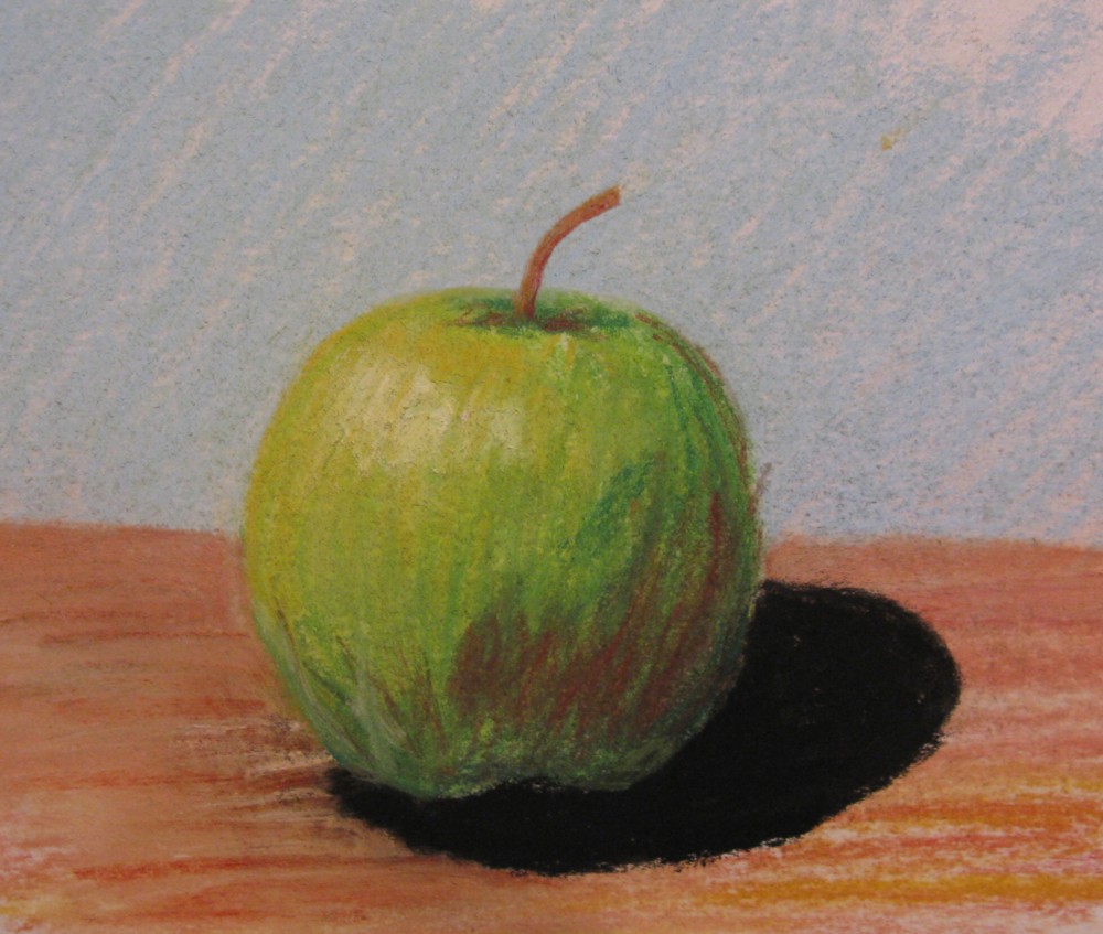
This first image shows a jet black shadow with no graduation in tone.  This makes it look a bit like a hole in your drawing!


When drawing in colour remember that shadows also contain colour they are never completely black, although in some cases a touch of black may be needed.  Shadows also graduate in tone, the darkest at the base of the apple and getting lighter the further from the source. 


This second image shows an outlined shadow that has also been drawn before the table surface was added and has been shaded in using curved marks that give the impression of a solid object.

Shadows are not solid objects.  Please don’t try to draw them as if they were.  I don’t recommend outlining any part of your drawing but especially not shadows.  Draw your solid objects first; the apple and table surface then add some background before adding the shadow. Without these elements the shadow could not exist in the real world and therefore cannot exist in your drawing.  Once you have the apple and table draw the shadow using colours that correspond to your composition and shading that follows the same direction as the shading used to describe the table surface.  Don’t be afraid to leave some of the table colour showing through the shadow this will make it appear less like a solid object and help unify the composition.  See below.


Happy drawing!
Remember to check back for more quick tips.

Monday, 17 September 2012

Review of Basingstoke Art Club exhibition at Fairfields Arts Centre

REVIEW: Basingstoke Art Club exhibition, Fairfields Arts Centre, until September 29

Those who doubt the talent of our town should attend this exhibition, given that it’s a feast of fantastic art from Basingstoke’s own. 

Basingstoke Art Club has organised art classes for its members for an unbelievable 60 years, and they meet in Fairfields, so it is appropriate that they have finally been given the two gallery spaces to display their undeniably accomplished work.

Sandy Kendall’s gorgeous florals burst with colour on the facing wall of gallery one, which also hosts pieces by the renowned Cicely Drewe, three by Brenda Perkins and Sherry Edmondson’s fascinating multilayer monoprints. Texture plays a key role in the work of Ivan Bellchambers, whose Web of Life is a fascinating circular watercolour.   

I quite fancied living in the gorgeous cottage captured by Lindsay J Berry’s The Springfield Sundial watercolour, and having a debate with the wary Liz Smith in Character sketch by Anita Leatherby!

Jim Blackford’s fired clay animals are resplendent in the cabinet before you’ll move to admire Arti Chauhan’s work, and feel drawn in by Ron Turrell’s Gossip, in which a young woman peers from behind net curtains, looking at the gathered figures in the street outside. Ron’s oil piece Memories is a charming coastal scene, complete with colourful beach hits and a little red kite.   

I was also fascinated by the detail in Pauline A Hall’s Shells and Seaweed, in contrast to Shirley Kirsopp’s Reflections 1 and 2, and the paintings and drawings of Ros Morton and Rolland Q Parris, which wonderfully capture the seasons.
 
And it’s all brought to a stunning conclusion with Bethany Milam’s trio of pieces featuring the agonies and ecstasies of competing gymnasts, their tears, their prayers and their smiles.

It is impossible to view this collection and not be impressed. Well done to all involved for their fantastic demonstration of another element of what cultural Basingstoke has to offer.

Thursday, 13 September 2012

More Than Sparrows

Lately I have been working on a sculpture of two sparrows made out of hair. 
 
The idea came from a sermon on Matthew 10 where it talks about the hairs on your head being counted, the Salvation Army Officer expanded on this surmising  that if God knew how many hairs are on your head he would know how many you left in your hairbrush that morning and how many lay on the hairdresser's floor.  This intrigued me and I began to look into using hair as a modelling material mixing it with glue and forming shapes.  I think this image was also partly inspired by a childhood memory of a poster with two sparrows on that had a paraphrase version of Matthew 10:31 on which I learnt by heart.

My hairdresser thinks I am mad having asked to keep my hair for the last two haircuts.  I was a little worried that I wouldn't have enough to finish both sparrows so had my hair cut a little shorter than I would have otherwise!   I also had a very odd parcel through the post containing some of a friend's black hair, which I used for the eyes.

For a lot of my work I use unusual or 'difficult materials' in a time consuming and intricate way.  I hope that this comes across in the delicacy of the final work.

sticking on legs and wings

testing his legs

 The finished sculpture

 ...and some close-up's

Tuesday, 11 September 2012

Olympic Portraits

Well it is all over but you can continue to relive the Olympic rollercoaster with these emotive portraits.

Three of my portraits of Olympic gymnasts are now on exhibition at Fairfield's Art Centre. Selected by Andrew Buchanan as part of the Basingstoke Art Club exhibition. The show is open until Saturday 29th September 2012.

Gallery Opening Hours:

From Thurs 6th Sept to Thurs 20th Sept: Mons, Tues, Weds and Thurs 9.30am – 4.45pm.
From Mon 24th Sept: Mons, Tues, and Thurs 9.30am – 8.00pm. Weds 9.30am - 6.00pm.


Fri by appointment.

Sat 29th Sept 9.30am - 1.00pm.
Closed Bank Holidays.


Admission Free


Victoria; Individual All-Around
Mixed Media
2012

 
Hannah; Vault
Mixed Media
2012

 
Alexandra; Beam
Mixed Media
2012